The brand name AMBERPHARM is composed of the two words: “AMBER” & “PHARM”. It thus forms our company name AMBERPHARM.
The word: “AMBER” means Bernstein in German. This valuable gemstone finds its origin in the Baltic region, our home. Amber consists of fossil resin of different plant species and was formed several 100 million years ago.
Already 40,000 years ago in the Old Stone Age amber gained more and more importance. Not only as a method of payment, but also in the artistic production of jewellery and as a valuable commodity, which was equal to precious stones and gold.

The word: “PHARM” was derived from the word pharmacology, the science of the nature and structure of remedies, their effects and their areas of application.
The production and application of naturopathic products is one of the oldest and most significant findings of mankind, on whose foundations modern medicine has developed.

We chose the name AMBERPHARM for a good reason, because it combines the naturally valuable and the original findings of naturopathy.

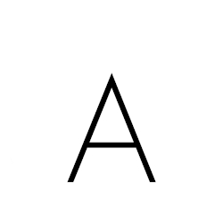
2 years later after the name “AMBERPHARM”, the first tentative attempts and ideas concerning the design of an own product logo were made. The first letter of our name should become a central part of our current logo. A product label from the time of the company’s foundation shows the A with a dot above it, hiding our current logo even then.

To complete the “A” as a body in its symbolic power as a human being in the logo, we decided to place a dot above the “A”. At the same time, this dot embodies the sun and the deity Ra, the god of gods from ancient Egyptian mythology, who through his work made all life on earth possible and allowed it to continue.

The dot above the “A” symbolizes not only a human head, but at the same time the spirit of man, which guides his actions throughout his life.

Together, the “A” with the dot symbolises a human body and its spirit, which is at the centre of our actions. This symbol, part of our logo, is intended to remind us and our customers that we act responsibly exclusively in the sense and for the benefit of people.

An additional circle frames our logo. It encloses our philosophy of high-quality cosmetic products and symbolizes the holistic approach that we pursue for the benefit of people. We develop exclusively bionic products because they can support the natural healing power and the self-healing process of the skin.


The brand name AMBERPHARM is composed of the two words: “AMBER” & “PHARM”. It thus forms our company name AMBERPHARM.

The word: “PHARM” was derived from the word pharmacology, the science of the nature and structure of remedies, their effects and their areas of application.
The production and application of naturopathic products is one of the oldest and most significant findings of mankind, on whose foundations modern medicine has developed.
We chose the name AMBERPHARM for a good reason, because it combines the naturally valuable and the original findings of naturopathy.

2 years later after the name “AMBERPHARM”, the first tentative attempts and ideas concerning the design of an own product logo were made. The first letter of our name should become a central part of our current logo. A product label from the time of the company’s foundation shows the A with a dot above it, hiding our current logo even then.

To complete the “A” as a body in its symbolic power as a human being in the logo, we decided to place a dot above the “A”. At the same time, this dot embodies the sun and the deity Ra, the god of gods from ancient Egyptian mythology, who through his work made all life on earth possible and allowed it to continue.

The dot above the “A” symbolizes not only a human head, but at the same time the spirit of man, which guides his actions throughout his life.

Together, the “A” with the dot symbolises a human body and its spirit, which is at the centre of our actions. This symbol, part of our logo, is intended to remind us and our customers that we act responsibly exclusively in the sense and for the benefit of people.

An additional circle frames our logo. It encloses our philosophy of high-quality cosmetic products and symbolizes the holistic approach that we pursue for the benefit of people. We develop exclusively bionic products because they can support the natural healing power and the self-healing process of the skin.


© Copyright 2020 Amberpharm GmbH
© Copyright 2020 Amberpharm GmbH